Alum promoted to partner & design director at Chicago Firm
Nick Adam MFA 18 GD was promoted to the position of Design Director and Associate Partner at Span in Chicago.
While at Span, Nick has played a pivotal role in expanding the field of graphic design into unconventional areas and fostering the growth of the practice.
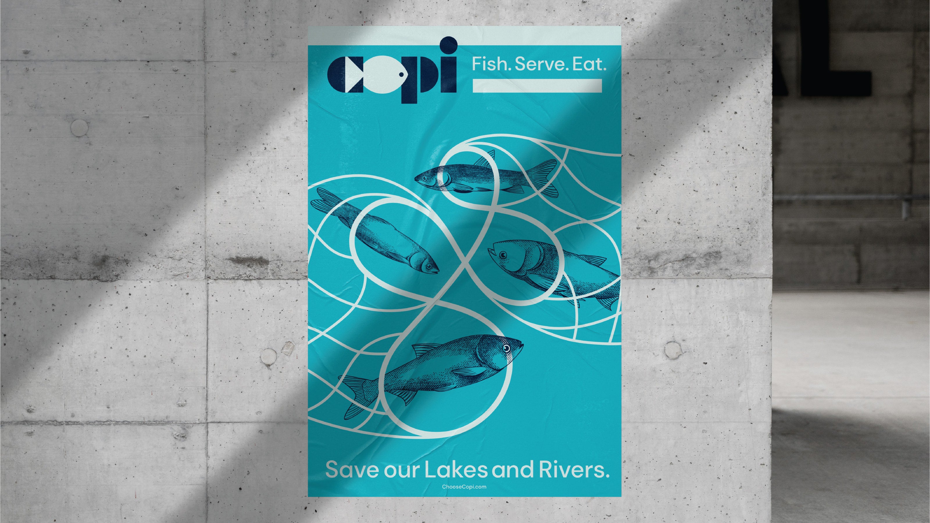
One notable project led by Nick and his team at Span addressed one of the most significant environmental crises facing the United States: the invasion of a fish species commonly referred to by a slang term. Interestingly, this same fish is recognized globally as the second healthiest and among the most delicious fish to eat.
Funded by the U.S. EPA, Nick and his team collaborated with various government departments and agencies to reshape public perceptions regarding this invasive fish. During the project's early stages, the team observed that these fish technically lacked a formal name in the U.S., and the slang term in use was needlessly racialized. To gain a comprehensive understanding of the fish, Nick and his team engaged ecologists, culinary professionals, and the systemic design firm Daylight to explore both the ecological and culinary aspects of the species. Through these collaborative efforts, valuable insights emerged, revealing the true characteristics of these fish.
These insights included their substantial size, with some weighing over a hundred pounds, an exceptionally high reproduction rate of one million new fish per female fish, and their standing as one of the cleanest and most nutritious fish in the world. These characteristics inspired Span to rename the fish "Copi" derived from the words "copious"; and "cornucopia"; After thorough vetting by ecologists, marine biologists, culinary experts, the general public, and government departments, Nick and his team embarked on designing the visual identity.
The Copi logotype, both simple and engaging, conveys a hidden message. The forward-facing fish is cleverly formed using the negative space within the letter "c," with the letter "o" creating the fish's body. The fish is perfectly centered within the geometric letterforms, taking inspiration from the Futura Black typeface. This stencil-style approach balances practical, utilitarian aesthetics with a playful touch through the use of simple semi-circles, triangles, and rectangles. Each letter is designed with maximum weight, mirroring the physical characteristics of the fish, which can weigh over 100 pounds, grow up to five feet in length, and produce over a million eggs per year.
The name and identity design system developed by Nick and his team at Span facilitated the onboarding of fish processors and distributors like Sysco, enabling Copi to find its place in restaurants and grocery stores across the national food hub. This endeavor aligns with the goal recognized by ecologists as essential to preventing catastrophic impacts on the Great Lakes and the highly vulnerable freshwater ecosystems in the U.S. The removal of Copi from U.S. freshwater systems is already having a positive impact that exceeds the projections of ecologists.
The name "Copi" has been adopted by Monterey Bay's Seafood Watch and is now officially listed in Webster's Dictionary. It is believed to be not only the first species named by a design studio but also the first word created by a design studio to enter the dictionary. Earlier this year Wired magazine featured Nick and Span in an article that explains how eating this fish can help save the planet. Recently the Copi name and visual identity won an Anthem Awards for Sustainability, Environment & Climate. These achievements underscore the importance of the inclusive process created by Nick and his team, that brought ecology experts and the public in the naming and identity design of these fish.
Many designers at Span were involved in this work, including former alumnus Suzie Shin 17 GD, that created the life-like illustration of the four fish that make up Copi.